MISSION
My journey began in response to the unique challenges of education during a pandemic, particularly the shift to distance learning. Despite the wealth of valuable resources already available, studies show that the effectiveness of these tools is often reversed due to Lack of attention to selecting an appropriate platform designed specifically for primary school students. For example, Zoom, although widely used, was primarily designed for business videoconferencing and its use in elementary education had negative consequences. This misguided choice negatively impacted students' academic performance and social-emotional development.
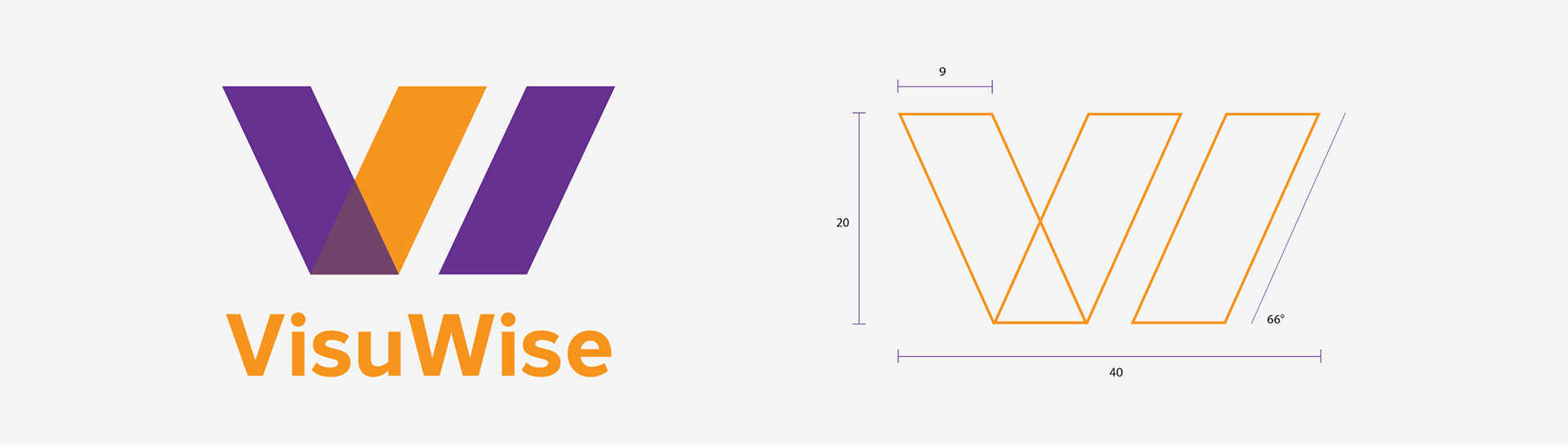
The horizontal logo should be used with appropriate orientations, like within a website navigation bar. Do not distort the logo, or change its elements. The logo was designed intentionally, and should not be changed.
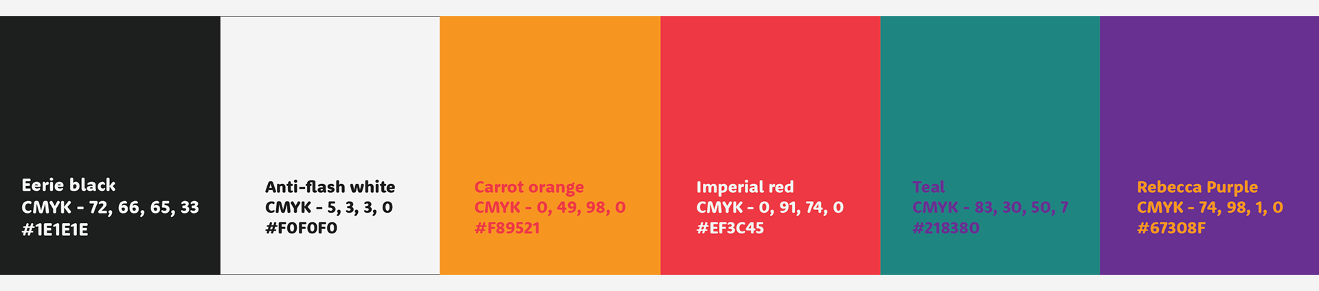
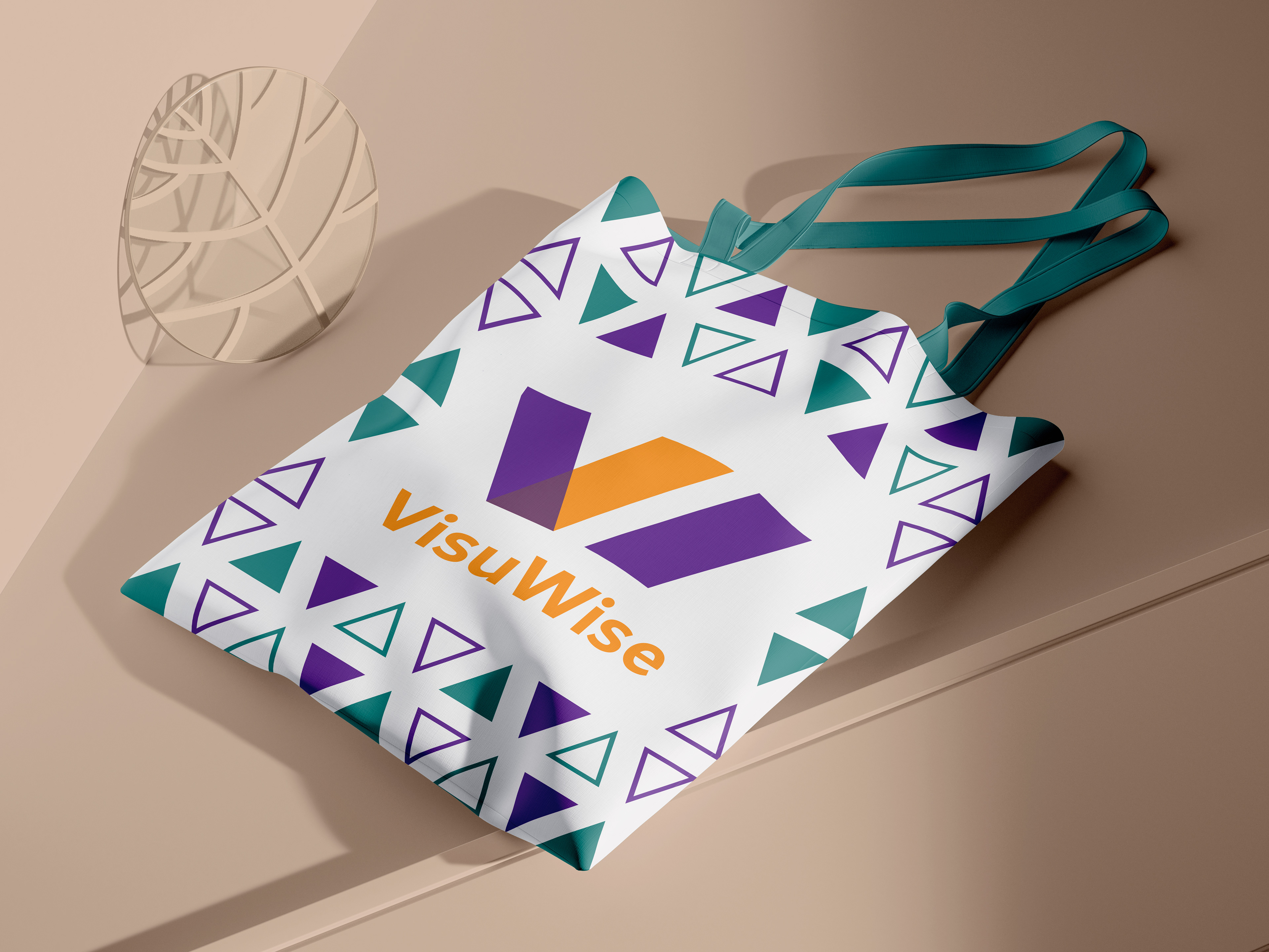
Unveiling the lively hues of Rebecca Purple, Teal, Imperial Red, and Carrot Orange, our child education brand caters not only to the little learners but also extends its vibrant embrace to the dedicated teachers and parents. Rebecca Purple inspires creativity, Teal fosters a calm and engaging atmosphere, Imperial Red signifies passion and determination, and Carrot Orange adds a playful touch. This dynamic palette is thoughtfully designed to resonate with the multifaceted aspects of learning and growth, creating a stimulating environment for young minds while supporting and engaging educators and parents in their vital roles.
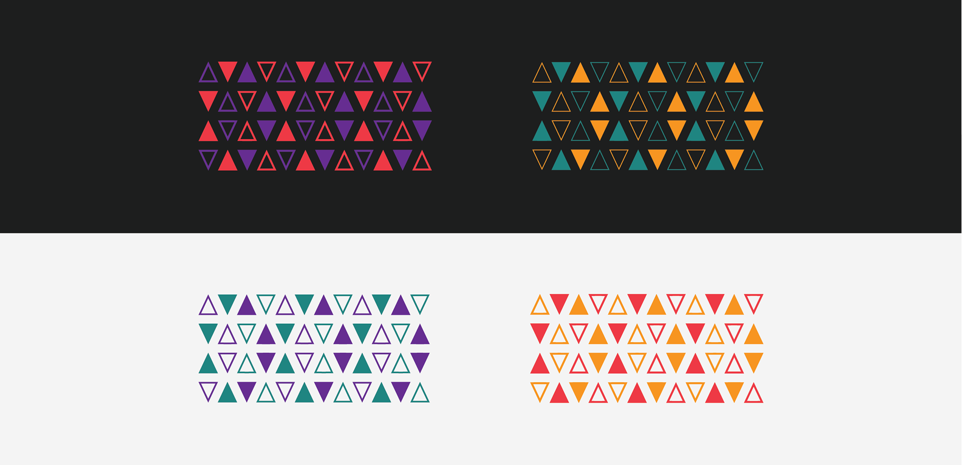
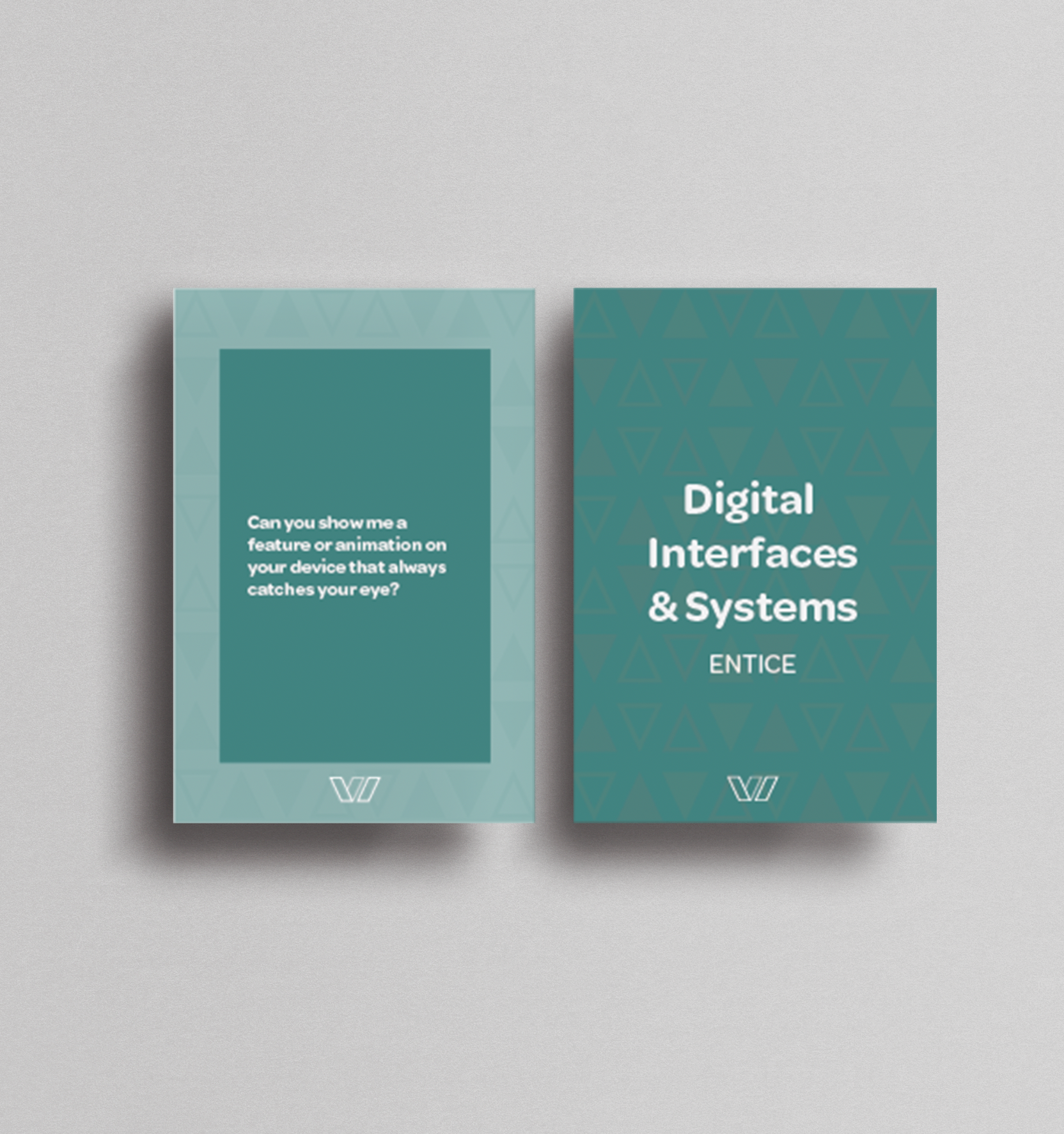
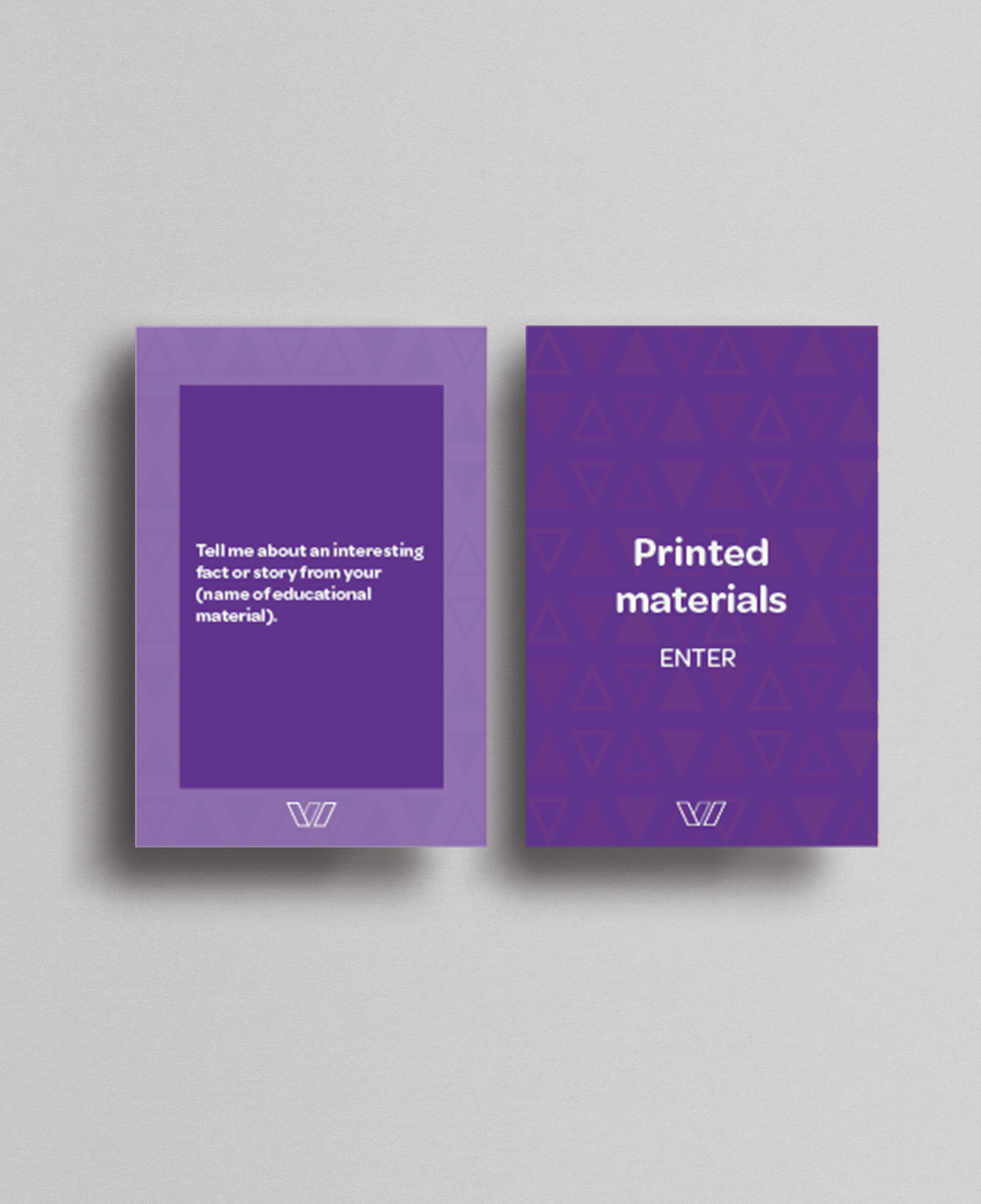
Triangle patterns, in solid and outline forms with varied colors, visually capture the dynamic and diverse essence of the brand. Solid triangles symbolize a strong educational foundation, while outlined ones represent openness to creativity. The array of colors reflects the vibrancy and inclusivity within our approach, creating an engaging environment for all.