Website Experience Designer at SCD
As a Website Experience Designer at SCD, I have gained a deep understanding of the Center’s mission, vision, and brand strategy, allowing me to accurately represent them on the website. I co-managed a comprehensive website redesign project and trained a new team member.

Web Design & Information Architecture
When I joined the Center, the website had not been redesigned in over two years. It had evolved incrementally, with sections added over time, but lacked a cohesive design. I began by exploring the Center’s various departments, including education, research, labs, and studios. Through my research, I realized that many areas, particularly the labs, classroom studios, and checkout windows, were not being adequately represented on the website.
I developed a concept to create separate branding for each space, showcasing the unique projects and courses happening in each area. This approach aimed to inspire visitors and highlight the capabilities and facilities of each department. I also took photographs of the Center’s spaces, including the checkout window and lab tools, ensuring the images reflected a unified brand identity and consistent visual design for the website.
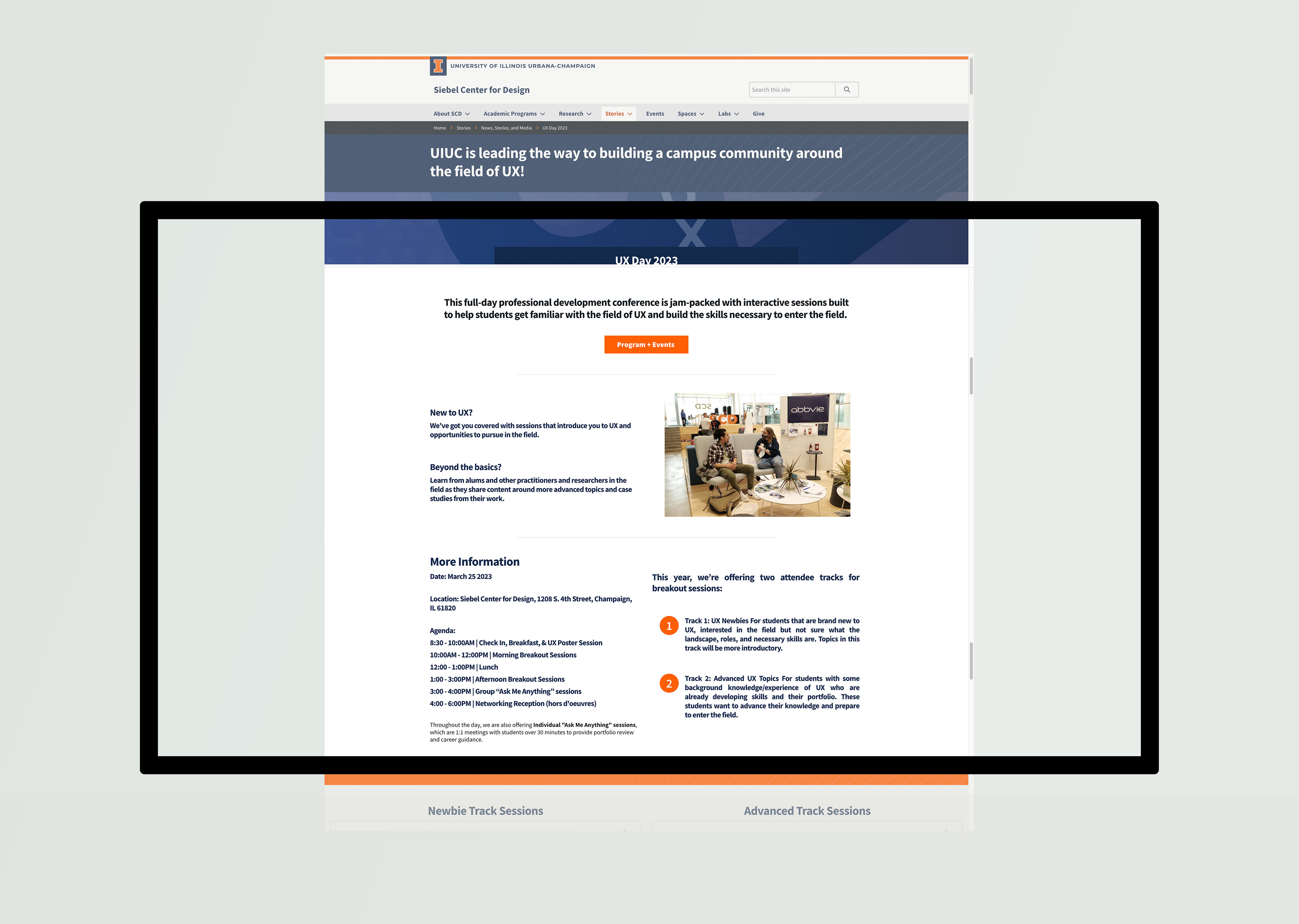
UX Day Page
One of the pages I designed for SCD was for UX Day 2023, a significant public event for the Center. Given the nature of UX design, this page needed to be highly inviting and engaging. Since it was open to external visitors, it also had to align with the University of Illinois' visual brand identity. I chose orange as a primary color, reflecting the university’s brand, and used imagery featuring orange tones to maintain a cohesive design throughout the page.
To manage the large amount of information, I broke the content into sections, using images from the previous year's event and a multi-column layout with a structured type system to create a clear and inviting user experience.
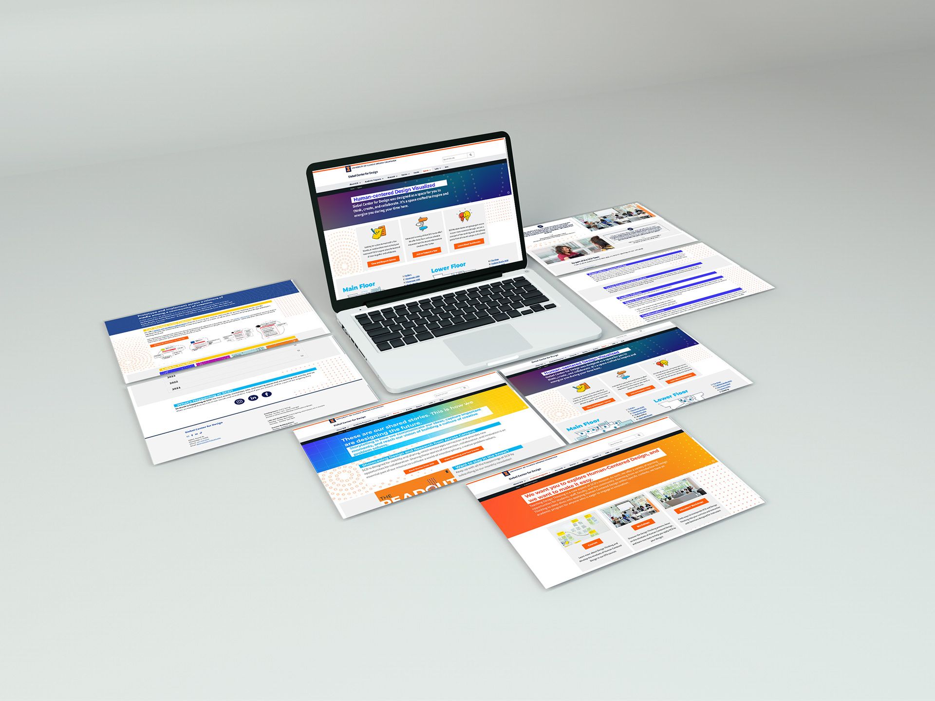
Website Redesign
After three years, we initiated a complete design upgrade for the SCD website and other visual assets. I led this redesign project, which aimed to refresh the design and reflect the Center’s dynamic and inclusive environment. Given the variety of activities and projects at the Center, we introduced a colorful gradient with a subtle fade pattern for the main pages. To add energy without overwhelming the design, we used solid background colors to highlight headers.
Recognizing the potential for visual clutter, we established guidelines: gradients were reserved for main pages, while subpages used simpler solid colors. As visitors navigated deeper into the site, the design became progressively cleaner, ensuring a balanced and visually harmonious experience.